


Sketchbook Assignment 2A:
This assignment required us making different gradiations using composite charcoal, vine charcoal, and coloured pencils.I will have to say that when I was doing this assignment that the charcoal seemed to get all over me because I would find it on my hands, face, and some of my clothes even after I washed my hands. Though the charcoal vines were more brittle than the compressed charcoal, I loved the way that I could control the vines to make what I call fanned lines.

Sketchbook Assignment 2B
In this next assignment we had to do draw a composition piece from 4 different angles. I did mine a little differently since I just moved a couple days ago and all I have right now to draw is my kitchen. I used my counter, stove, and dishwasher (plus my mom’s cloth hand towel dispenser which is the black cylinder shape on the counter) to do this assignment. It did deem to be a bit difficult for me when it came to drawing it at the left and top angles, but I tried to take my time in order to get the right details. And for some reason, my last photo will not attach straight.


Texture Panels
This project entailed drawing 12 different textures as a practice for future assignments. This project was a little bit difficult for me in the fact that I was trying to find 12 different textures because after doing 8, I was running out of ideas. I also struggled with trying to draw plastic laynard and yarn textures. The easiest for me would be the leaf and the honey comb textures. Below is a list of the different textures that I used.
1. Spider web leaf (basically a fake leaf from my old halloween decoration that has “spiderwebs” on it 2. My wood floor 3. The metal tool box that came on my brothers truck 4. My cat’s spots 5. Wooly yarn basket 6. Burlap Bow 7. Honey comb 8. Air vent cover 9. My friend’s snake 10. Baseball bat handle 11. Tile Floor 12. Plastic Lanyard Charm bracelet

Assignment 4: Pop can
My next assigned piece was to draw a crushed pop can which turned out to be more of a feat for me than most of my other projects. It was was pretty difficult for me for several reasons, first being finding a soda can since I don’t drink out of cans I couldn’t seem to find a single can (ended up buying a whole case, but at least I had visitors so it didn’t go to waste). The second was drawing the crushed can itself because, I couldn’t figure out how to make the dents and the textures of the crushed can. But after drawing the same can 11 or 12, I lost count, different times I finally realised that I was shading with the wrong pencil: it was graphite when I should have used entirely charcoal. I loved using charcoal because it gave me the ease to shade by using different weighted pencils.

Paper Bag Assignment
Yet another shading and texture assignment, this of which we were to draw a crumpled paper bag. Though it deemed to be a bit easier than the pop can; it was still not a simple task of drawing the crumpled paper textures. I’m still working on improving my shading, but still feels like it’s better than the pop can. I decided to use vine charcoal for the outline and shadow and for the shading I used a white charcoal pencil for the lighter places and a graphite pencil.

Mass & Volume Part 1
This week we are learning about cross contouring, negative space, and light and dark. We were assigned to draw 4 different objects using cross contouring, then another set of objects that emphasized light and dark, and finally use four types of chairs to draw negative space. I would have to say that being a makeup artist, drawing contour lines on a piece of paper is quite different from drawing contour lines on a person. I’m also learning how to draw hands in this as well, so my hand looks more like something the green goblin would have. As for light and dark, I loved this part of the assignment since I’m perfecting my shading and charcoal skills. However, I did mess up on the negative space part because I misread the assignment thinking that I had to draw 4 different objects rather than 4 different chairs and as you can probably see I am still learning the concept of negative space right now.


Mass & Volume Part 2/ Midterm
For our midterm assignment we were told to use knowledge from your book, skills you have learned, and techniques from your personal skill level, assignments, and sketching exercises, find or create a composition which emphasizes Shape and Form, Mass and Volume. Therefore, my final composition piece was a poster cut out of Deadpool sitting in a chair that I saw at one of the theatres that I went to.

1,2,3 Point Perspective
This week’s assignment was to draw two drawings each for one, two, and three point perspectives. It was one of my few favourites of all of the assignments because it was a bit easier to do. It took me awhile to figure out what I wanted to draw for my second half of the drawings. My favourite was probably not the easiest for me to draw but it was something I’ve seen almost every day. Which was the single point drawing of a hospital hallway where I normally waited for my dad to get out of surgery or chemo.. I also loved the two point Tardis. When it came to drawing three point drawings it was a little harder for me to figure out how to draw something to make it look like there were 3 points of perspective.


In order to do this week’s assignment we had to pick out 5 different complex shapes and do a composition piece of them. I took a picture at Father and Sons of 5 items that were already placed together. I figured this would be some what complex because of the two rickety old fans and the weird old tape recorder. I will say that the desk was also a hard one to shade at the bottom because the back pieces were much darker and shadowy in the original picture than the front pieces were.

Coloured Pencil Work
For the coloured pencil work piece, we had to draw 6 different items with coloured pencils. I’d have to say that I enjoyed this assignment because I love working with colour even though I am red-green colour blind (thank goodness for coloured pencils that have labels). For the first set I used a happy meal that I had devoured the other day with the little pony that I had gotten with it; the second half of the first set is an idea that I have for a makeup competition that I’m entering this fall and I wanted to draw some ideas so it’s a gorey mermaid hand. The second set includes one of the masks that I had bought last year for a cosplay that I’ll be doing at animazement which is a masquerade Mad Hatter and the second side includes part of the face that I will be doing for the gorey mermaid (I have yet to figure out what I’ll be doing for the eyes, so I only included the bottom half of my face). The final set I included is I had done an April fools prank on my mom pretending that I actually spilled some nail polish on the bathroom counter when in reality it was special effects. The other half of the final set is a tattoo of a teapot on my friend’s leg.


This is the rough draft of the final product for next week’s assignment. We had to make 4 landscape sketches and pick out the one that I liked the most to draw for the final draft. For this piece I had went to Charleston, SC for spring break which is where I did all of these sketches and I now finally have the chance to post them. I actually loved doing this project because landscapes are my favourite things to both photograph and paint. This place was lovely since even though the leaves were still blooming in on the trees the purple Spanish moss gave it it’s oomph even though you can’t tell in these photos, I have colour in my final drawing. The first sketch is my favourite since it will be the one with the most colour and since it was raining throughout the whole trip everything looked dreary and deserted. I’m also glad I was able to expand on the first one (which I’m still putting the finishing touches on) since it looks like in the sketch that it doesn’t have much depth.

Landscape Final Draft
This was the final draft of my landscape assignment in which I chose the first sketch that I had done out of the four in the previous week. I added a bit of colour so it would add some life to the page.

Self portrait#1
With, the final project coming up, we were assigned to make 3 self portraits for the remaining three weeks of class. The first self portrait was to be of a serious face. This I would have to say was one of the most frustrating projects so far because I am not good at drawing people let alone proportionate eyes which is why when I normally paint faces on a canvas the eyes are always closed or looking down or ghost like. But I figured hey this is for class I must challenge myself. The picture I ended up using I realized covered my other eye with my crazy thick hair so I guess it moderately worked out? Overall I filled out 8 pages of me getting frustrated with the eyes, the face, or just the proportions in general. This is my final piece which I will be improving on for the next project when it comes to making different faces.

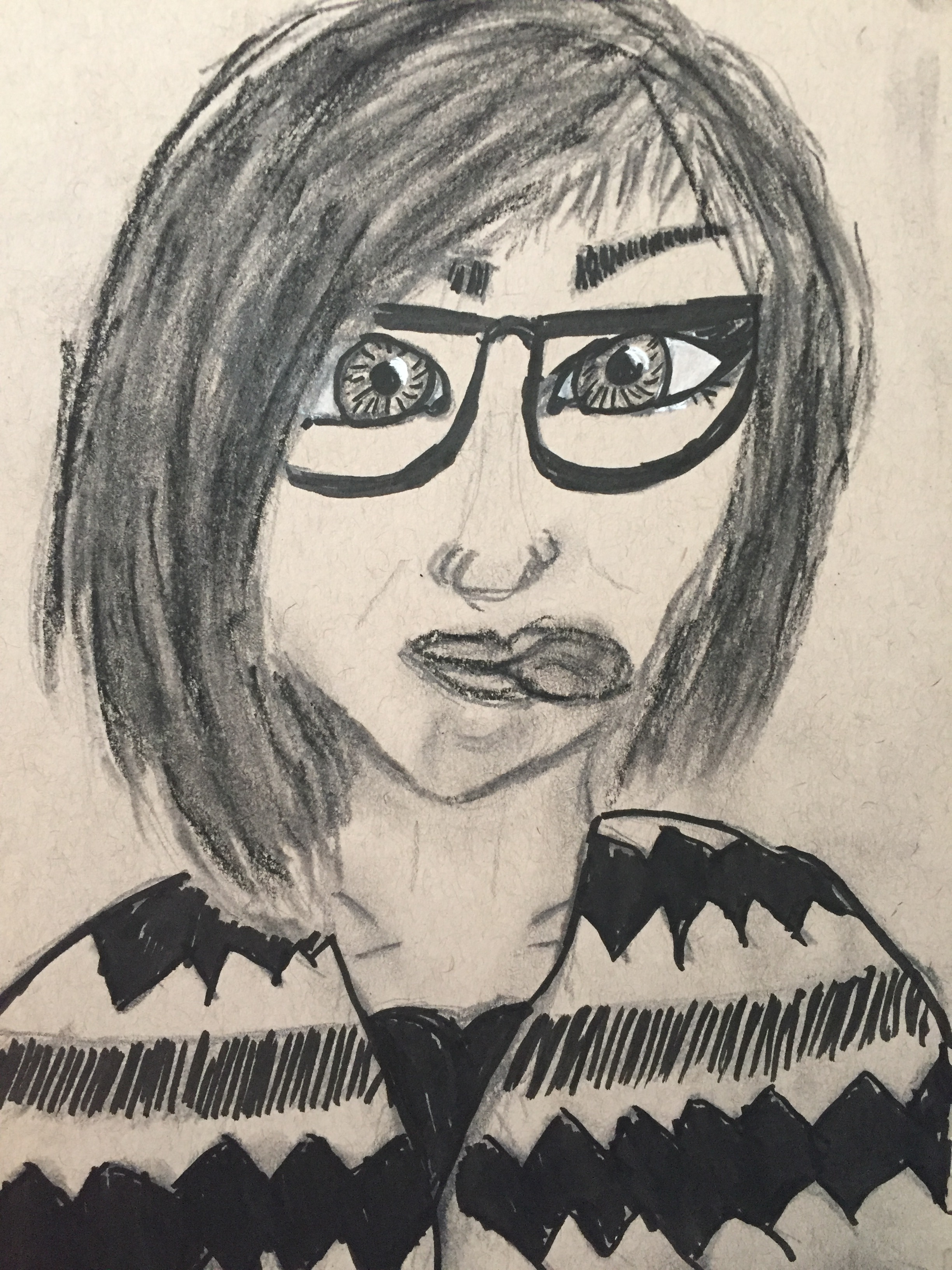
Self Portrait #2
The self portrait for this week involved drawing a portrait of myself making a silly face. I feel like I’m somewhat improving with drawing people. This week I realised that with the last drawing I didn’t put much depth to my neck and face, so I tried a few different techniques and this was the one I was most satisfied with that didn’t make me look old enough to be my mom. I had a bit of difficulty again with the eyes since when I kept looking at them the first time they made me look like I had Asian eyes rather than Italian (but I’m used to doodling anime if I ever do draw people so I was trying to draw as realistically as possible). The tongue was an issue as well…no matter how I drew it, it looks more like I’m poorly trying to pop bubble gum than a tongue.
For the last self portrait that we had to do was to make a portrait of something that we found really interesting. This week I chose to draw myself as the goth clown that I had done for a Halloween makeup challenge this past year. Since it was my first avant garde makeup challenge I would have to say it wasn’t as lovely as it was in the actual drawing. I would have to say that I think I’ve been getting better over the past couple weeks at drawing self portraits and that I would actually use these skills again when I’m sketching out makeup ideas for competitions or cosplays.

For this project I had to draw a model from their chest up with a blanket or bed sheet draped around them. Since I chose my dad as the subject I had to take a few nice shots of him wrapped up in his blanket. I knew that I wouldn’t be able to make him sit for that long since he get’s tired easily. This was a bit more difficult to draw since one it wasn’t myself and secondly he has plenty of wrinkles and tiny scars. Another difficulty was trying to make the bald part on his hair. Overall this was a difficult project to do since he had a blank stare in all of the photos I took. However, I am glad that this project is complete and summer is nigh.

